ADVERTISEMENT

WrestleStat Testers Wanted

andegre

Well-Known Member
May 18, 2004
4,185
906
1
Hey fellas (and ladies), as I've mentioned before, WrestleStat is undergoing some major changes this offseason. As we're getting closer to finishing up, we'd like to have some people start testing the new version of the site to identify any bugs, or design changes that you like/don't like, or functionality that you'd like to see added.

Not everything has been converted over to the new design yet, like the design of the wrestler comparison page (check out the dual comparison page), or selecting a school or wrestler profile page for a different season, or selecting a different season and/or week of rankings pages, but those will but updated shortly.

We'd really appreciate any positive/negative feedback that you can provide.

Here's a link to the new version of the website....even though the website name says "test", it is using REAL/LIVE production database.

https://test.wrestlestat.com

Thank you
andegre & @obrats
 
Luv2test ur software!

Notes (no idea what's a bug or what's just the testing environment):
- I logged in with my jtothep creds & name displays as Andegre
- Played successfully with PSU-tOSU comparison, then clicked WrestleTrak, got this error:

HlrWmAh.png


Hope that helps!
 
Luv2test ur software!

Notes (no idea what's a bug or what's just the testing environment):
- I logged in with my jtothep creds & name displays as Andegre
- Played successfully with PSU-tOSU comparison, then clicked WrestleTrak, got this error:

HlrWmAh.png


Hope that helps!
Yep, that's one bug (WrestleTrak) that I noticed last night after deploying....I'll get that fixed first.

Haha, I think I may have hard-coded the username once the user is logged in. Tell me, when you are logged in, when click "Andegre" profile menu, do you see the option "Admin Menus"?
 
Love the new Wrestler Rankings page (the overall color scheme is quickly growing on me), and also love the Video counter each wrestler. What are the green numbers next to the whites?

eVieRCv.png
 
Yep, that's one bug (WrestleTrak) that I noticed last night after deploying....I'll get that fixed first.

Haha, I think I may have hard-coded the username once the user is logged in. Tell me, when you are logged in, when click "Andegre" profile menu, do you see the option "Admin Menus"?

No, I'm unable to demolish your entire site from the inside (as of yet ;)

6UGqVSS.png
 
Love the new Wrestler Rankings page (the overall color scheme is quickly growing on me), and also love the Video counter each wrestler. What are the green numbers next to the whites?

eVieRCv.png

Oh, now I see the green View All Wrestlers button, but still not sure what the background green numbers mean?

LhsRz0V.png
 
  • Like
Reactions: andegre
Andgre..Love your work! Just logged on quickly and didn't do a total rundown..

But two things I noticed..

1. On 141 weight class rankings you have N Lee 6th but there's only 4 guys ahead of him (you went 1-4 and then 6-33)

2. Not sure about others, but when I did wrestler comparison, the red really messes with my eyes (super bright). Also, it shows for example 0-1 vs the opponent, but it's not highlighted below so you can't quickly find that match.

Keep up the good work
 
  • Like
Reactions: andegre
Love the new Wrestler Rankings page (the overall color scheme is quickly growing on me), and also love the Video counter each wrestler. What are the green numbers next to the whites?

eVieRCv.png
The background green (and sometimes red) next to the ranking is for the trend. Green means they moved up X spots since the previous weeks rankings, while red means they moved down...
 
Andgre..Love your work! Just logged on quickly and didn't do a total rundown..

But two things I noticed..

1. On 141 weight class rankings you have N Lee 6th but there's only 4 guys ahead of him (you went 1-4 and then 6-33)

2. Not sure about others, but when I did wrestler comparison, the red really messes with my eyes (super bright). Also, it shows for example 0-1 vs the opponent, but it's not highlighted below so you can't quickly find that match.

Keep up the good work
Regarding #1, that's a side-effect of wrestlers switching weights, and me not re-running the rankings process after those weight changes were made.

Another task I have is to update my batch processing system so I can run the rankings in an automated fashion on a weekly basis. Right now, I have to go into the database to fire off the rankings process because if it takes longer than 30 seconds to run, it will fail (when executing from the website). I'm working on a process that will allow it to run beyond the 30 seconds, without failing.

Regarding #2, are you talking about the red in the common opponents tables for each of those common match results? If yes, I'm thinking of switching that to white because someone else (via email) mentioned the red was hard to read there as well.
 
  • Like
Reactions: pish69
Regarding #2, are you talking about the red in the common opponents tables for each of those common match results? If yes, I'm thinking of switching that to white because someone else (via email) mentioned the red was hard to read there as well.

Yes..the common opponents tab is where I have a real hard time seeing it all since the red is so bright and my eyes go buggy. Also..for example, if you take Nolf vs Kemmerer..they have a whole list of common opponents, all in that bright red. But the matches against each other should have a different color or highlighted I would think. This way I could quickly see how they did against each other instead of going thru each opponent
 
  • Like
Reactions: andegre
I prefer if you highlight when two wrestlers have faced each other in the common opponents screen for the team dual comparison. Sometimes the list of common opponents is long and you can miss when the two have faced each other.
 
  • Like
Reactions: andegre
Regarding #2, are you talking about the red in the common opponents tables for each of those common match results? If yes, I'm thinking of switching that to white because someone else (via email) mentioned the red was hard to read there as well.

That was me going through email. Habit I guess. I see you already changed the user name field so we are no longer you. :)

As I mentioned, I really like the new layout, think its very intuitive, and though data may have been there, I am easily finding new ways to look at things I didn't know how before.

I'm interested if the red bothers anyone else (messes with my old eyes) other than Pish and I. Maybe a lighter color like yellow (to contrast with the things you have in white), but whatever you come up with, your site is invaluable, and we all appreciate the work you put in on it.
Yeah, that might be too homer-ish if I switch to black and yel....GOLD ;)

Yes, actually "CowboyUp61", the OSU guy on HawkeyeReport said he's color blind and either can't, or doesn't see the red-on-black very well.

Maybe I switch all links to be white underlined instead of the red-underlined to see how that works. Main reason it's red is because I want people to easily identify what are links, and what's "just text".

I'll work on changing the red hyperlinks to white...

Thanks again!
 
  • Like
Reactions: Gebmo
We rejected the users' change that did this transfer.
Figured as much and really appreciate what you're doing, am more poking fun at the reaction that caused here. Sorry, I can see my crack going sideways.

I should've asked JP if he did anything squirrelly like transferring Spencer Lee to PSU, or dropping the entire Poke roster by 3 weights, or giving PD3 another year. Something more obviously a joke.
 
Testing 1 2 3. I don't like the red color for the opponent names on this page: https://test.wrestlestat.com/rankings/dual/60/penn-state
It seems to "shimmer". (not i am not drinking or high) :)

The red looks good with the darker green background (like the words
Dual Rankings) but not so much on the lighter gray.

Frankly, all the red seems to look the same to me and I guess I'd have to get used to it.

If it were me, I make the colors based on HEX COLOR: #093162; HEX COLOR: #FFFFFF;  ;)
 
  • Like
Reactions: Antaeus
Testing 1 2 3. I don't like the red color for the opponent names on this page: https://test.wrestlestat.com/rankings/dual/60/penn-state
It seems to "shimmer". (not i am not drinking or high) :)

The red looks good with the darker green background (like the words
Dual Rankings) but not so much on the lighter gray.

Frankly, all the red seems to look the same to me and I guess I'd have to get used to it.

If it were me, I make the colors based on HEX COLOR: #093162; HEX COLOR: #FFFFFF;  ;)
Yeah, I was trying to use the CSS "Red" color, which supposedly transforms to #FF0000. But I'm integrating SASS compiler with this new version, so I'm still learning the places to override the default/custom colors for the site....

Regarding the red-on-black in tables, I'll switch those to white to see how they look...
 
  • Like
Reactions: jtothemfp
Yeah, I was trying to use the CSS "Red" color, which supposedly transforms to #FF0000. But I'm integrating SASS compiler with this new version, so I'm still learning the places to override the default/custom colors for the site....

Regarding the red-on-black in tables, I'll switch those to white to see how they look...
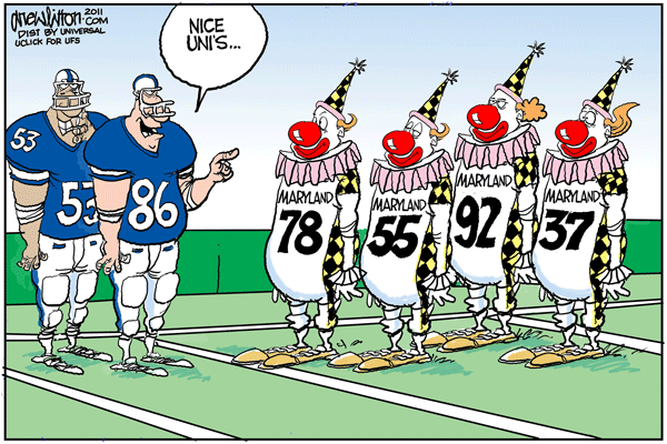
Hey who am I to complain. I think Maryland has the best helmets in D1
 
Hey fellas (and ladies), as I've mentioned before, WrestleStat is undergoing some major changes this offseason. As we're getting closer to finishing up, we'd like to have some people start testing the new version of the site to identify any bugs, or design changes that you like/don't like, or functionality that you'd like to see added.

Not everything has been converted over to the new design yet, like the design of the wrestler comparison page (check out the dual comparison page), or selecting a school or wrestler profile page for a different season, or selecting a different season and/or week of rankings pages, but those will but updated shortly.

We'd really appreciate any positive/negative feedback that you can provide.

Here's a link to the new version of the website....even though the website name says "test", it is using REAL/LIVE production database.

https://test.wrestlestat.com

Thank you
andegre & @obrats

As someone who has color blindness issues plus old eyes, the red lettering on the gray background is very hard to read (at least that is what I think the colors are anyway).
 
Hey @Ski @dbldoofus @Gebmo @pish69 I've updated the colors to be white for the hyperlinks. Let me know if that looks better for everyone.

Also, I haven't made the change for the head-to-head match results on the common opponents sections, I'll get to that next.
 
Hey @Ski @dbldoofus @Gebmo @pish69 I've updated the colors to be white for the hyperlinks. Let me know if that looks better for everyone.

Also, I haven't made the change for the head-to-head match results on the common opponents sections, I'll get to that next.

The white looks good to me. Much easier to read and follow. Just spent a lot of time looking at teams, comparison's, etc......while I am supposed to be working. That tells you that I like it. ;)
 
The white looks good to me. Much easier to read and follow. Just spent a lot of time looking at teams, comparison's, etc......while I am supposed to be working. That tells you that I like it. ;)
Great! I have some other little things to clean up, like the red or green outlined buttons on the rankings [per weight] pages. I'm going to convert all of those to be solid red or green so they are easier to see.

I'd like your feedback here, which button is easier for you to see?

This version has both the red and green outlined buttons at the top, they say "View All Starters for 125" (red) and "View all Wrestlers for 125" (green).

https://test.wrestlestat.com/rankings/starters

Now compared to this page where it has the solid colors....crap, I thought there were some [public] pages that had the solid buttons....I guess not.

Regardless, can you see those outlined buttons very well? I believe that was one of the ones you said you couldn't see, but just want to confirm.

Thanks again!
 
Hey @Ski @dbldoofus @Gebmo @pish69 I've updated the colors to be white for the hyperlinks. Let me know if that looks better for everyone.

Also, I haven't made the change for the head-to-head match results on the common opponents sections, I'll get to that next.

Much better!! Only thing hard for me to see is what you typed in search bar (not a huge deal). The grey with the dark background doesn't contrast well
 
Great! I have some other little things to clean up, like the red or green outlined buttons on the rankings [per weight] pages. I'm going to convert all of those to be solid red or green so they are easier to see.

I'd like your feedback here, which button is easier for you to see?

This version has both the red and green outlined buttons at the top, they say "View All Starters for 125" (red) and "View all Wrestlers for 125" (green).

https://test.wrestlestat.com/rankings/starters

Now compared to this page where it has the solid colors....crap, I thought there were some [public] pages that had the solid buttons....I guess not.

Regardless, can you see those outlined buttons very well? I believe that was one of the ones you said you couldn't see, but just want to confirm.

Thanks again!

The red is easier than the green in this situation
 
  • Like
Reactions: andegre
The red is easier than the green in this situation
Pretty sure I know the answer to this. FS results don’t count towards predictions. I see in the Cornell vs PSU dual that Tucker is projected to beat RBY by major even though RBY beat him at the U23 trials. Wouldn’t expect FS results to factor into folkstyle projections. Still it was interesting that the projection is for MD. That will change after RBY has wrestled a few matches.
 
Last edited:
The red is easier than the green in this situation

Agreed, but its not too bad when the whole page is not like that. Also, I like that when you hover over things it brightens up and you get the white on red/green. Makes it very easy to read, though technically, having the white on red/green all the time would make it very easy to read.
 
  • Like
Reactions: andegre
Pretty sure I know the answer to this. FS results don’t count towards predictions. I see in the Cornell vs PSU dual that Tucker is projected to beat RBY by major even though RBY beat him at the U23 trials. Wouldn’t expect FS results to factor into folkstyle projections. Still it was interesting that the projection is for MD. That will change after RBY has wrestled a few matches.

Freestyle doesnt come into play. Tucker wrestled a bunch of college matches last year, RBY hasn't. You won't see any true frosh with good rankings until they get matches under belt.

Gable Stevenson is ranked 122 and they have Nevills winning by major 16-3. Obviously this will change as Gable gets matches in.

By the end of the year it should work out. Andegre said he made some tweaks so that by year end, his algorythym will beat all the human rankers
 
  • Like
Reactions: andegre
Apologies if this wasn't part of the intended testing.

1. "Register" timed out / returned error.
2. "Forgot Password" didn't send reminder/reset email.
3. The text font on both of those pages is black (on grey background).

Features
1. I may be missing it in the test version, but have not yet located it - ability to view individual rankings by conference.

2. Would enjoy having in a future version: Conference record (Win%). Particularly if it could parse out Win% against starters vs. non-starters. It's a factor in trying to guesstimate B1G tournament seeding.

Many thanks.
Thank you!

#1 & #2 - didn't know about the Register and Forgot Password bugs, I'll take a look at those...
#3 - Yep, these are going to get cleaned up soon

Feature #1 - this page? https://test.wrestlestat.com/rankings/weight/125/big-ten
Looks like I linked to the wrong version though...

when on this page: https://test.wrestlestat.com/rankings/starters
then clicking "View all Wrestler for 125": https://test.wrestlestat.com/rankings/weight/125
then clicking one of the conference buttons goes to: https://test.wrestlestat.com/rankings/starters/weight/125/big-ten
where it accidentally goes to the "starters" version instead of the regular version.

Looks like I have some other problems on the rankings pages too, I'll look at those this weekend as well.
 
  • Like
Reactions: bscaff1
I appreciate what you do!

SIAP: Both on my iPhone's and on my iMac's Safari browsers, I find that the text size of almost all text is very small, and the background is very large. In other words, I see little tiny letters on huge grey background. That is a waste of space and also makes the text hard to read, for no good reason. Functionally and aesthetically, that's not good.
 
Hey @Ski @dbldoofus @Gebmo @pish69 I've updated the colors to be white for the hyperlinks. Let me know if that looks better for everyone.

Also, I haven't made the change for the head-to-head match results on the common opponents sections, I'll get to that next.

Love the white. Also I am on my 4th beer, so take that with a grain of salt. but the white doesn't shimmer after 4 beers and the red shimmered after no beers.
I will catch up with the rest of the thread later.
 
Maybe it’s just personal preference, but I do not like the last name first for the rankings.

Under profile options, I got “404 Page Does Not Exist”

On the “About WrestleStat” page, the black lettering on gray background is almost impossible to read.

Love the ease of use... Maybe Flo will ask you to help them out with their next “enhancement”.
 
Last edited:
  • Like
Reactions: andegre
I appreciate what you do!

SIAP: Both on my iPhone's and on my iMac's Safari browsers, I find that the text size of almost all text is very small, and the background is very large. In other words, I see little tiny letters on huge grey background. That is a waste of space and also makes the text hard to read, for no good reason. Functionally and aesthetically, that's not good.
Is it possible to post a screenshot of what you see? Confused as to what/where this is. I do 99% of my testing in Chrome...
 
Is it possible to post a screenshot of what you see? Confused as to what/where this is. I do 99% of my testing in Chrome...

As an FYI, I use firefox for this on my computer and chrome on my phone/tablet (android) and have no issues.

I also tried safari on my wife's iphone and was same as everything else, no issues. No idea what would be going on with DW's browsers.
 
ADVERTISEMENT
ADVERTISEMENT